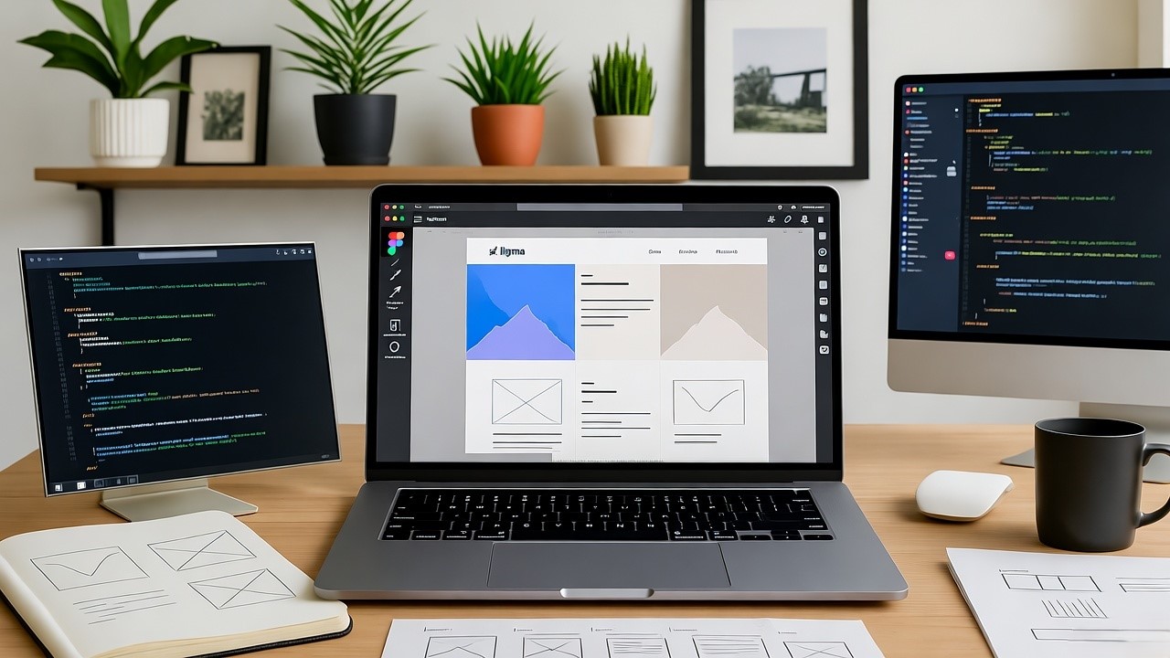
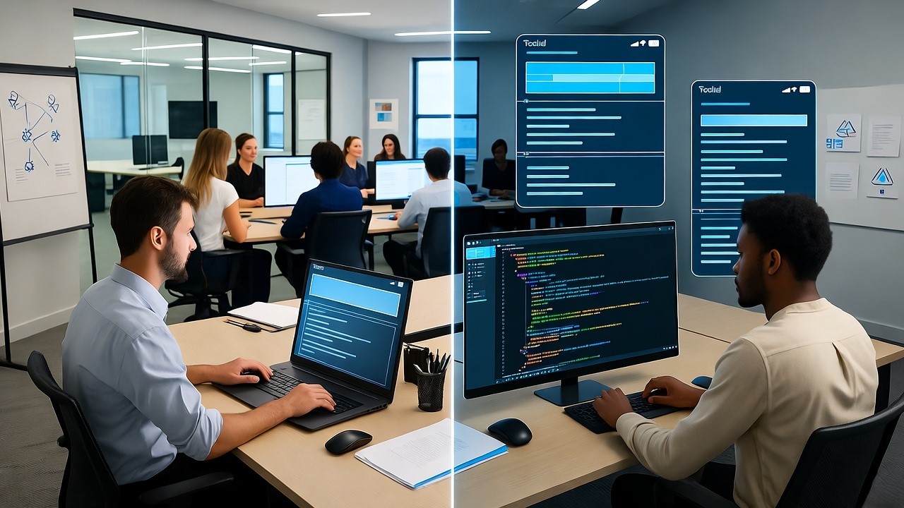
Crafting a successful user interface (UI) requires blending design aesthetics with technical precision. By pairing robust tools like Niral, which transforms Figma designs into clean code for Angular, Vue.js, React, and React Native, with best practices, you can accelerate development and deliver intuitive UIs.
Below, we’ll break down each step with technical insights and actionable tips.
1. Prioritize Simplicity and Clarity
A simple UI minimizes Website Design & Development cognitive load, allowing users to accomplish tasks without confusion.
- Design Tip: Use whitespace effectively to create breathing room between elements.
- Technical Insight: Ensure your Figma components are modular and clean. When using Niral, these components will be translated into manageable, reusable code snippets. For example, create buttons as reusable design elements in Figma, which can translate to scalable React components.
2. Follow a Consistent Design Language
Consistency ensures familiarity and reduces the learning curve for users.
- Design Tip: Define and adhere to a design system with a standard set of colors, typography, and spacing. Tools like Material Design and Fluent UI can help create a cohesive design language.
- Technical Insight: When converting Figma designs with Niral, ensure the design system's variables (e.g., colors, fonts) are exported as global CSS or SCSS variables. This ensures consistency across all components in your app.
3. Ensure Responsiveness and Scalability
A responsive UI guarantees optimal performance on different devices.
- Design Tip: Use Figma's auto-layout to simulate responsive designs for different breakpoints.
- Technical Insight: Niral supports CSS frameworks and responsive grids. By designing with constraints in Figma (e.g., percentage-based widths or auto-layout), the generated code will naturally translate into responsive components using Flexbox or CSS Grid.
4. Use Intuitive Navigation
Good navigation reduces user friction and enhances usability.
- Design Tip: Use familiar UI patterns like tab bars, side menus, or breadcrumbs. Ensure clickable areas are large enough for touch interactions.
- Technical Insight: Navigation elements in Figma, such as a sidebar or menu, are seamlessly translated into functional navigation components (e.g., React Router or Vue Router) with Niral. Ensure links and buttons are semantically correct (<a> tags for links, <button> for actions).
5. Leverage Visual Hierarchy
Visual hierarchy helps users focus on essential elements by guiding their attention.
- Design Tip: Use typography (e.g., headings vs. body text), size, and contrast strategically.
- Technical Insight: Figma’s text styles map directly to CSS classes or Tailwind classes during code generation in Niral. For example, H1 headers in Figma can map to class="text-3xl font-bold" in Tailwind or equivalent CSS styles.
6. Optimize for Speed and Performance
Performance optimization is crucial for retaining users.
- Design Tip: Minimize animations or effects that could slow down interactions. Use vector-based designs to ensure scalability.
- Technical Insight: Niral generates optimized code that avoids redundancy, reducing load times. For example, SVG icons in Figma translate into scalable inline SVGs in React or Vue.js, reducing HTTP requests compared to image-based icons.
7. Focus on Accessibility
An accessible UI ensures inclusivity for users with disabilities.
- Design Tip: Use color contrast checkers and simulate designs with tools like Stark for accessibility compliance. Add descriptive text for icons and visuals.
- Technical Insight: Figma’s alt text annotations are preserved in Niral’s code as aria-label or alt attributes, ensuring screen readers can interpret your designs. For example, ensure buttons have meaningful labels: <button aria-label="Submit form">Submit</button>.
8. Test and Iterate Frequently
Testing helps identify usability issues before deployment.
- Design Tip: Use prototyping tools in Figma to simulate user flows and gather feedback.
- Technical Insight: Niral’s rapid design-to-code conversion allows quick iteration. For instance, if users find a modal design confusing, you can quickly update the Figma file, regenerate the code, and deploy changes seamlessly.
9. Incorporate Feedback Loops
Interactive feedback helps users understand their actions.
- Design Tip: Include loading spinners, success messages, or inline error validations in your design.
- Technical Insight: Micro-interactions designed in Figma, such as button hover states or progress indicators, can translate into animated CSS or JavaScript implementations. Niral ensures these transitions are cleanly integrated into the final code.
10. Align Design with Business Goals
A UI should align with the product’s purpose and user goals.
- Design Tip: Design call-to-action (CTA) buttons that are visually prominent. Optimize conversion paths by reducing unnecessary steps.
- Technical Insight: Use Niral to track changes and ensure business-driven UI adjustments are reflected in the code. For instance, updating a CTA button's design in Figma to "Get Started" will automatically update the relevant React or Vue component.
By following these detailed UI design tips and leveraging Niral's powerful design-to-code capabilities, you can create user interfaces that are intuitive, accessible, and technically robust. Niral eliminates manual coding errors, accelerates development, and ensures that your Figma designs are faithfully translated into high-quality, production-ready code. Whether you're designing for Angular, Vue.js, React, or React Native, Niral is your go-to tool for seamless design implementation.


